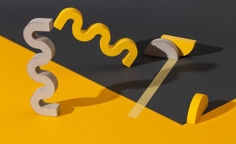
As most creatives know, every year American colour company Pantone announce a colour they predict will influence all design trends throughout that year, from interior and fashion, to graphic design and branding. For 2021, Pantone have treated avid followers to two colours of the year: PANTONE 13-0647 Illuminating and PANTONE 17-5104 Ultimate Gray.
After the uncertainty and worry that filled 2020, it’s speculated that Pantone wanted to choose two colours that would represent hope and resilience, which 2021’s colour union certainly does. PANTONE 13-0647 Illuminating is a bright, cheerful yellow, filled with joyful hope and solar power. Whilst PANTONE 17-5104 Ultimate Gray is strong embodiment of natural elements that exudes resilience and steadiness. Both shades are bold in their own rights but paired together this duo is a union that radiates clarity, strength and positivity.
Leatrice Eiseman, Executive Director of the Pantone Color Institute, explains that: “the union of an enduring Ultimate Gray with the vibrant yellow Illuminating expresses a message of positivity supported by fortitude. Practical and rock solid but at the same time warming and optimistic, this is a colour combination that gives us resilience and hope. We need to feel encouraged and uplifted; this is essential to the human spirit.”
Both shades pull inspiration from bold natural elements, with Ultimate Gray being compared to weathered stones that can be found whilst walking along a beach and Illuminating pulling influence from the bright sunny days that most of us Brits spend our year longing for. Creatives will be able to spot this shade duo being used throughout all trends this year to reinforce the uplifting feeling of hope, joy and resilience we could all use a bit of.
This isn’t the first year Pantone have chosen 2 shades for their Colour of the Year, back in 2016 Pantone treated us to Pantone 13-1520 Rose Quartz, a pale Millennial pink & Pantone 15-3919 Serenity, a powdery light blue, to reflect the mindfulness and well-being focus that was on everyone’s mind.
Colours have always played a carefully considered part in design elements, such as logos, email creatives and landing pages. As well as aesthetics, colours can be used to evoke emotions. For example, blue is commonly used by social media platforms as studies have shown that the colour blue can be associated with intelligence, communication and trust. Yellow can bring the feeling of excitement, making it the perfectly colour for call-to-action prompts on any landing page, whilst grey is said to encourage trust. Paired together, these can be a great combination for both email campaigns and landing pages to encourage users to trust in your brand and make them to want to click-through to find out more information. Whilst yellow and grey aren’t a new colour pairing, we can definitely expect to see more of this power shade duo throughout interior, fashion, marketing and branding trends during 2021! If you want to find out more about colour theory and it’s use in design, head over to our The Future’s Bright – But is the Future Orange blog!