It’s the first impression, it’s what draws a customer to an offer, it’s what converts the click, it’s really important!
In most cases with this first interaction ‘less is more’, keeping a page simple is so effective in making sure customers follow the call to action, and convert!
Here at Monetise we often critique landing pages, and can usually see a clear correlation between a strong page and a higher conversion rate.
So, what does make an effective landing page?
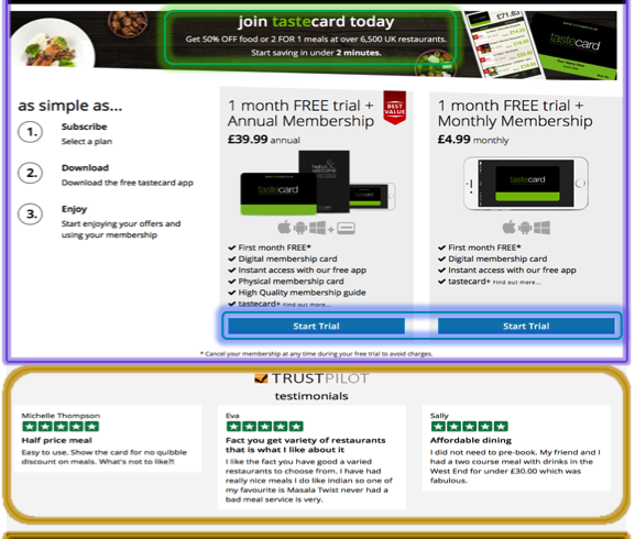
An example of a landing page that offers all of these traits and converts really well is Taste Card.
I’ll start with their ‘Call to Action’, It’s displayed in the middle of the page and is a big blue ‘Start Trial’ button. This button features twice on the page for the two-different membership offers. This LP also offers minimal leakage, the only other clickable button on the page is the logo, which takes the user to Tastecard’s home page in a separate tab.
The deal is clear at the top of the page and explains in one simple sentence why the user should join. It also explains down the left-hand side how easy it is to save money with the offer.
A great feature of this page is how simple it is. It doesn’t require the customer to read loads of text and is so easy to follow. It’s a simple 3 field form that shouldn’t take any longer than 30 seconds for the user to fill in.
I can’t stress enough how important it is for a page to be trustworthy! As soon as you get to this page it clearly shows three 5-star trust pilot rating, supported with strong customer testimonials. So now the customer knows its secure, and can trust the offer. Another way to increase the trust factor is to link social media pages to the landing page, and this is one of the only ways I feel this landing page could be made better.
The most important thing is that the page is mobile optimised! It is surprising how many pages are not, considering that 80% of UK adults now have a smartphone. Such a simple way to increase views and of course conversions!